Theme - Primer
⚠️ No longer supported ⚠️ - A UI + syntax theme for @SublimeText inspired by GitHub's UI.
Details
Installs
- Total 28K
- Win 14K
- Mac 9K
- Linux 5K
| Jul 14 | Jul 13 | Jul 12 | Jul 11 | Jul 10 | Jul 9 | Jul 8 | Jul 7 | Jul 6 | Jul 5 | Jul 4 | Jul 3 | Jul 2 | Jul 1 | Jun 30 | Jun 29 | Jun 28 | Jun 27 | Jun 26 | Jun 25 | Jun 24 | Jun 23 | Jun 22 | Jun 21 | Jun 20 | Jun 19 | Jun 18 | Jun 17 | Jun 16 | Jun 15 | Jun 14 | Jun 13 | Jun 12 | Jun 11 | Jun 10 | Jun 9 | Jun 8 | Jun 7 | Jun 6 | Jun 5 | Jun 4 | Jun 3 | Jun 2 | Jun 1 | May 31 | |
|---|---|---|---|---|---|---|---|---|---|---|---|---|---|---|---|---|---|---|---|---|---|---|---|---|---|---|---|---|---|---|---|---|---|---|---|---|---|---|---|---|---|---|---|---|---|
| Windows | 0 | 0 | 0 | 0 | 0 | 0 | 0 | 0 | 0 | 0 | 1 | 0 | 0 | 0 | 0 | 0 | 0 | 0 | 0 | 0 | 0 | 0 | 0 | 0 | 0 | 0 | 0 | 0 | 0 | 0 | 0 | 0 | 0 | 0 | 0 | 0 | 1 | 0 | 0 | 0 | 0 | 0 | 0 | 0 | 0 |
| Mac | 0 | 0 | 0 | 0 | 0 | 0 | 0 | 0 | 0 | 0 | 0 | 0 | 0 | 0 | 0 | 0 | 0 | 0 | 0 | 0 | 0 | 0 | 0 | 0 | 0 | 0 | 0 | 0 | 0 | 0 | 0 | 0 | 0 | 0 | 0 | 0 | 0 | 0 | 0 | 0 | 0 | 0 | 0 | 0 | 0 |
| Linux | 0 | 0 | 0 | 0 | 0 | 1 | 0 | 0 | 0 | 0 | 0 | 0 | 0 | 0 | 0 | 0 | 0 | 0 | 0 | 0 | 0 | 0 | 0 | 0 | 0 | 0 | 0 | 0 | 0 | 0 | 0 | 0 | 0 | 0 | 0 | 0 | 0 | 0 | 0 | 0 | 0 | 0 | 0 | 0 | 0 |
Readme
- Source
- raw.githubusercontent.com
⚠️ No longer supported ⚠️


Primer
A custom UI and syntax theme for Sublime Text 2/3 that comes in, both, a light and dark variation. Based on GitHub's UI and design guidelines.
Themes
Primer
Default flavor based on GitHub's UI.
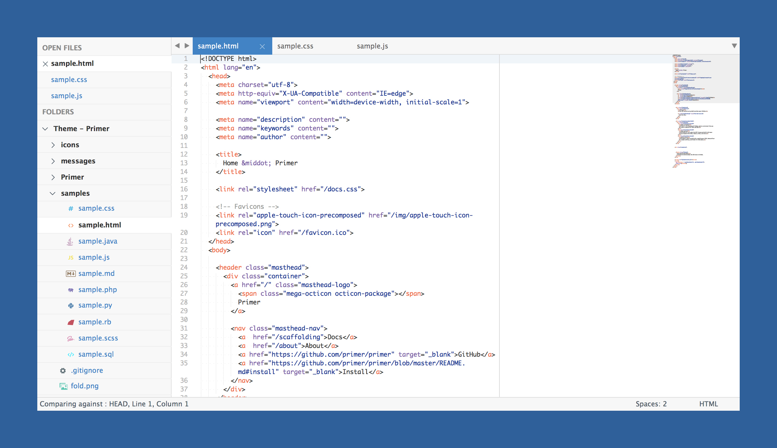
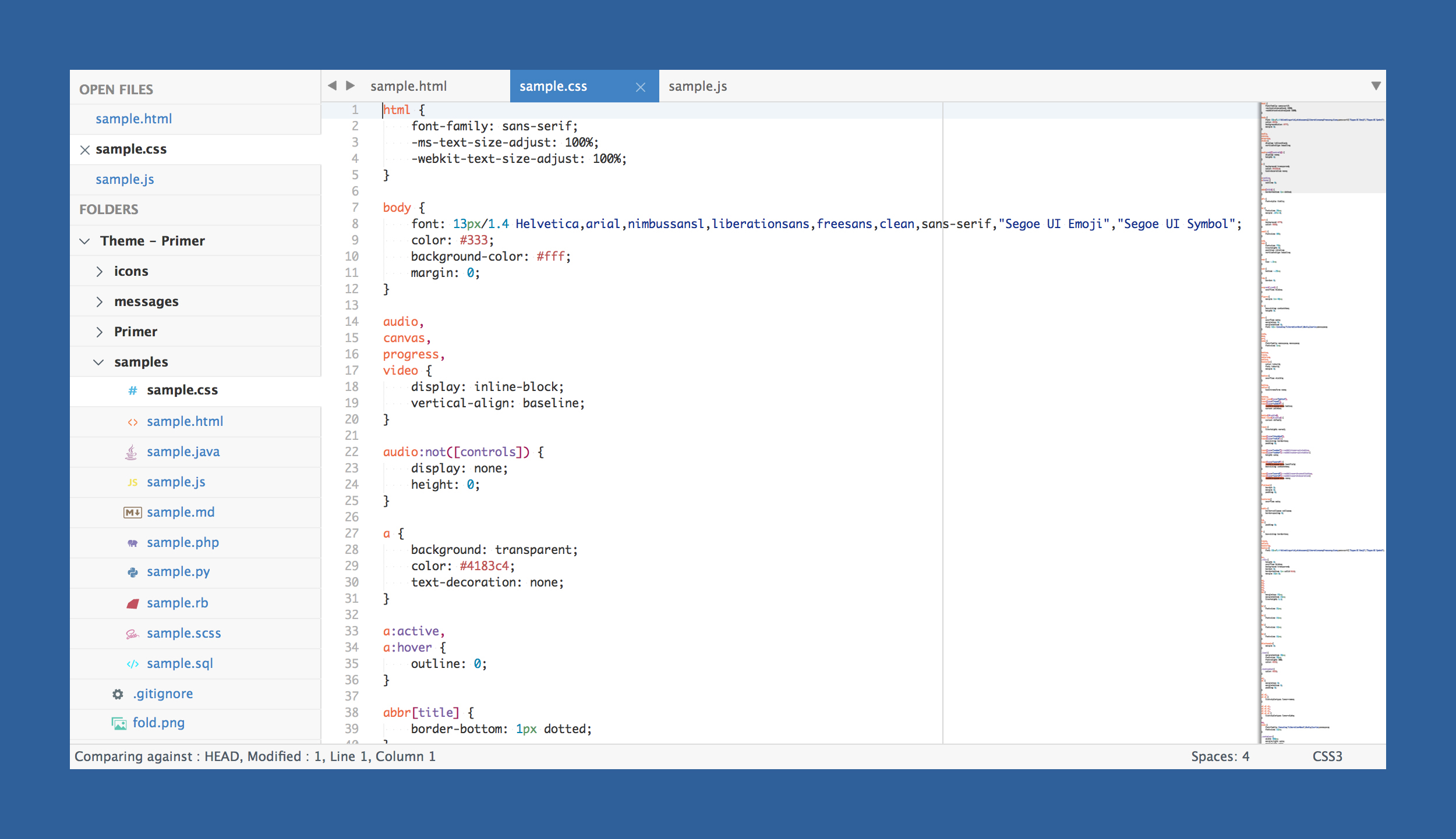
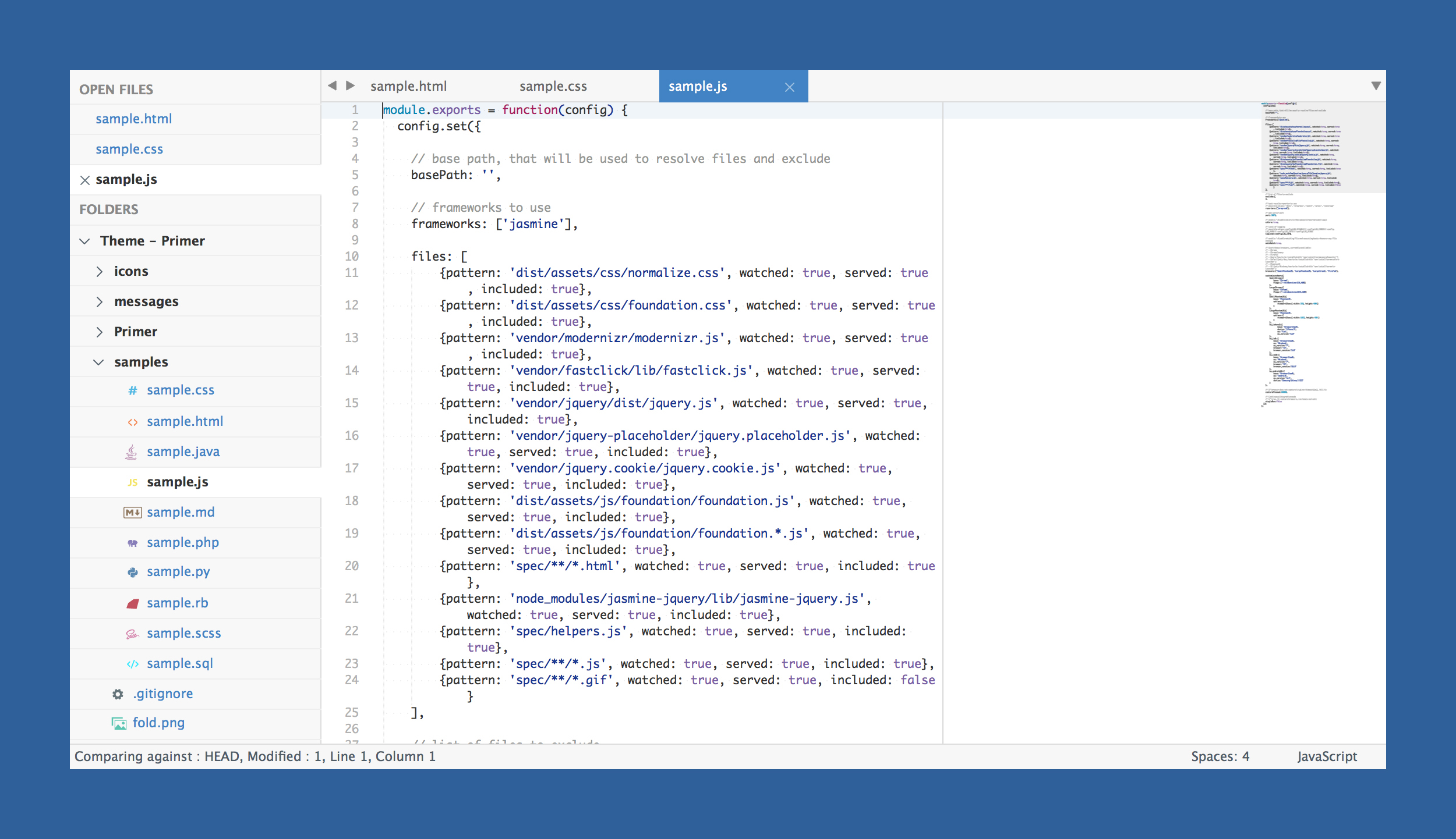
The font used in the screenshots is Monaco.
How to Install
Via Package Control
The easiest way to install is using Sublime Package Control, where Primer is listed as Theme - Primer.
- Open Command Palette using menu item
Tools -> Command Palette...(⇧⌘P on Mac) - Choose
Package Control: Install Package - Find
Theme - Primerand hit Enter
Manual
You can also install the theme manually:
- Download the .zip
- Unzip and rename the folder to
Theme - Primer - Copy the folder into
Packagesdirectory, which you can find using the menu itemSublime Text -> Preferences -> Browse Packages...
How to Activate
Activate the UI theme and color scheme by modifying your user preferences file, which you can find using the menu item Sublime Text -> Preferences -> Settings - User (⌘, on Mac).
Primer comes with different accent colors based on GitHub's color scheme (http://primercss.io/colors/).
Note: Don't forget to restart Sublime Text after activating the theme.
Settings for Primer
Light
{
  "theme": "Primer.sublime-theme",
  "color_scheme": "Packages/Theme - Primer/primer.light.tmTheme"
}
Dark
{
  "theme": "Primer Dark.sublime-theme",
  "color_scheme": "Packages/Theme - Primer/primer.dark.tmTheme"
}
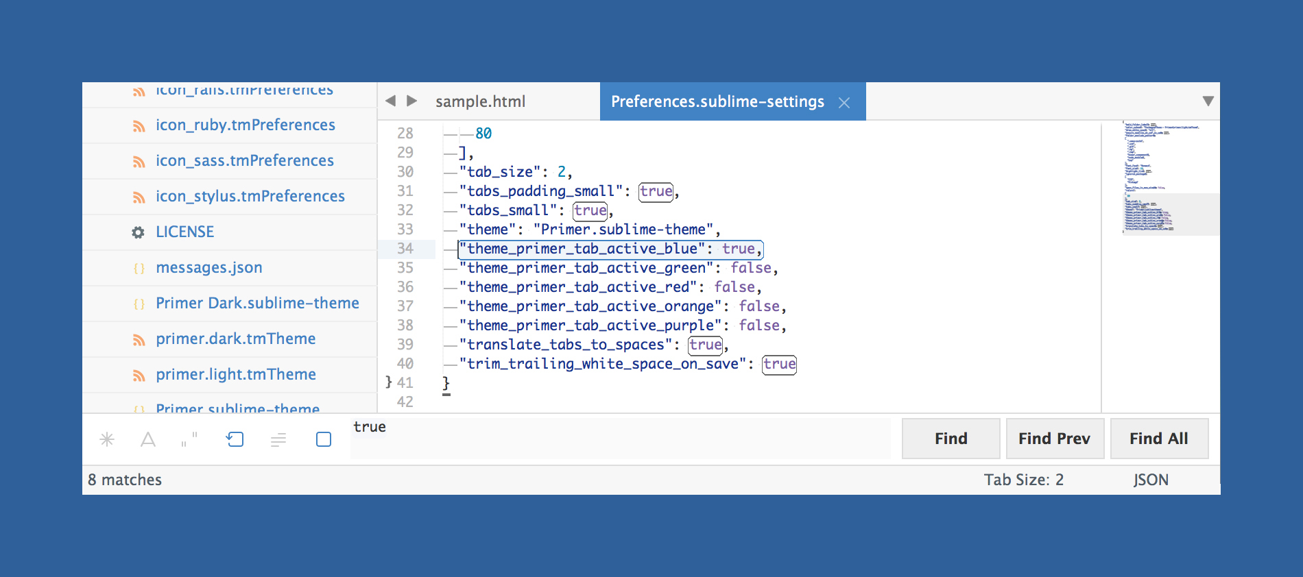
Customization
Only choose one setting per section.
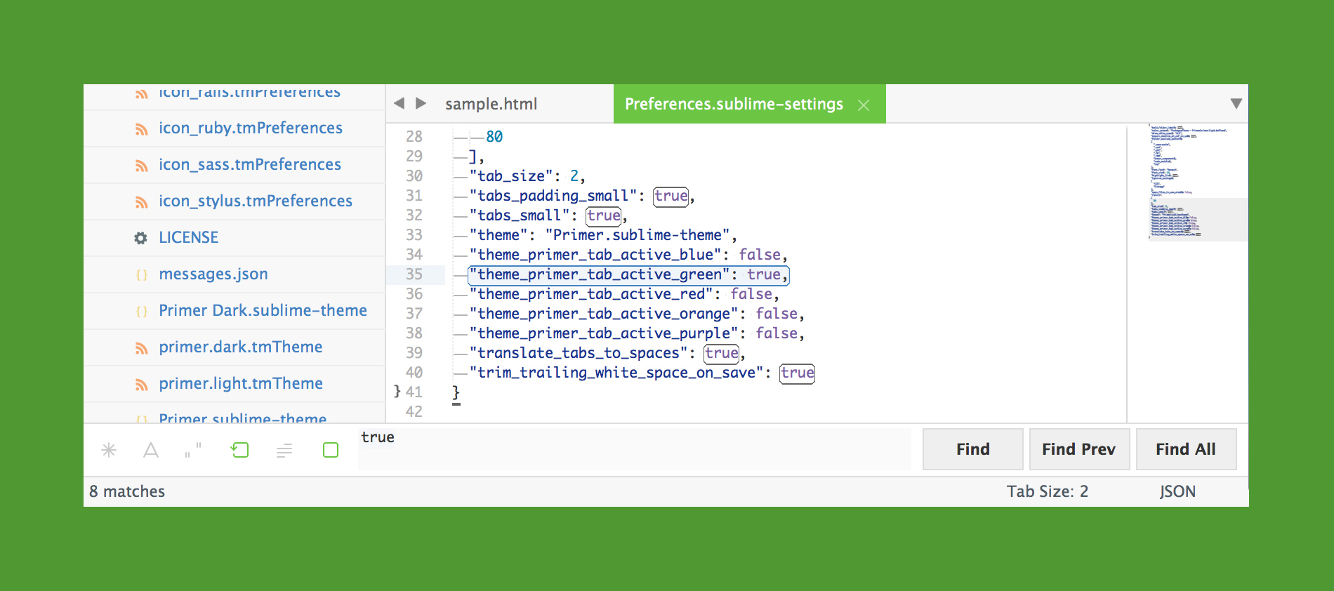
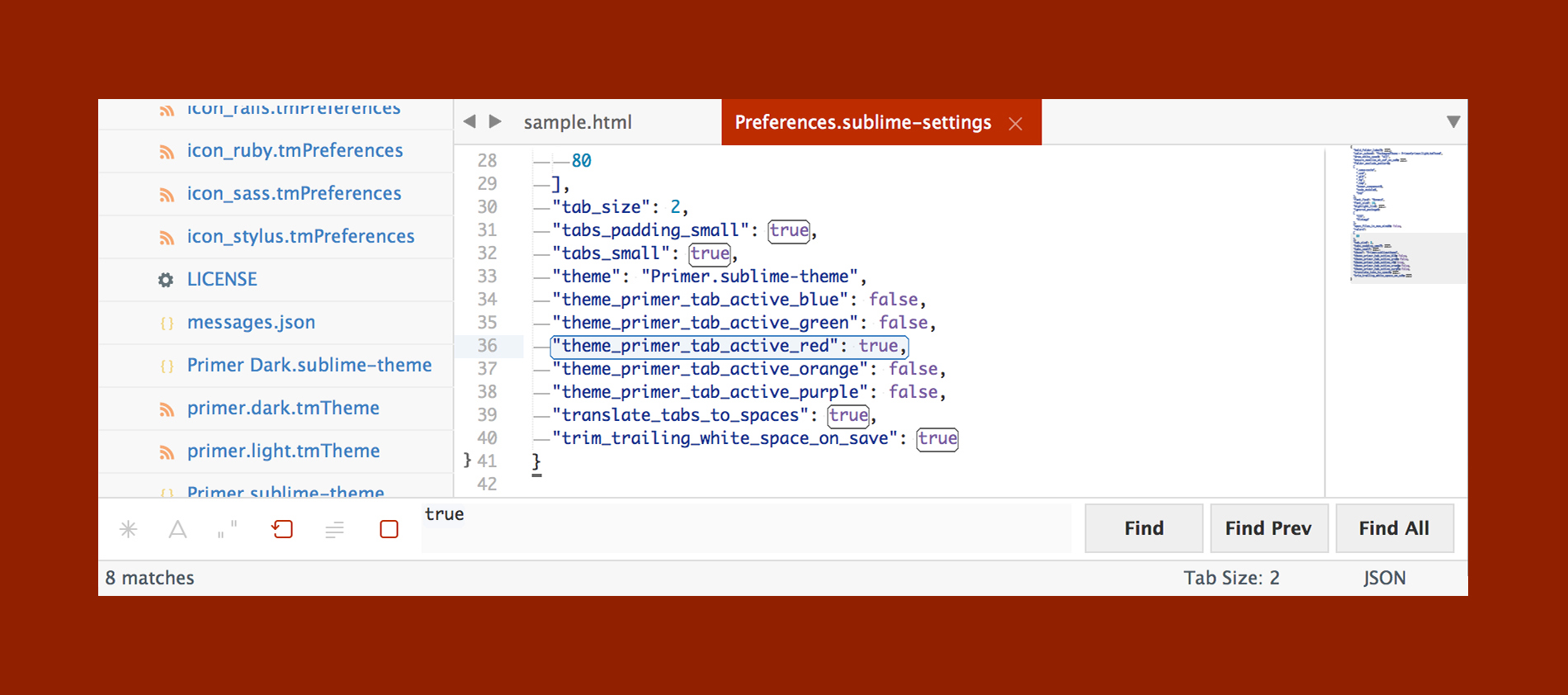
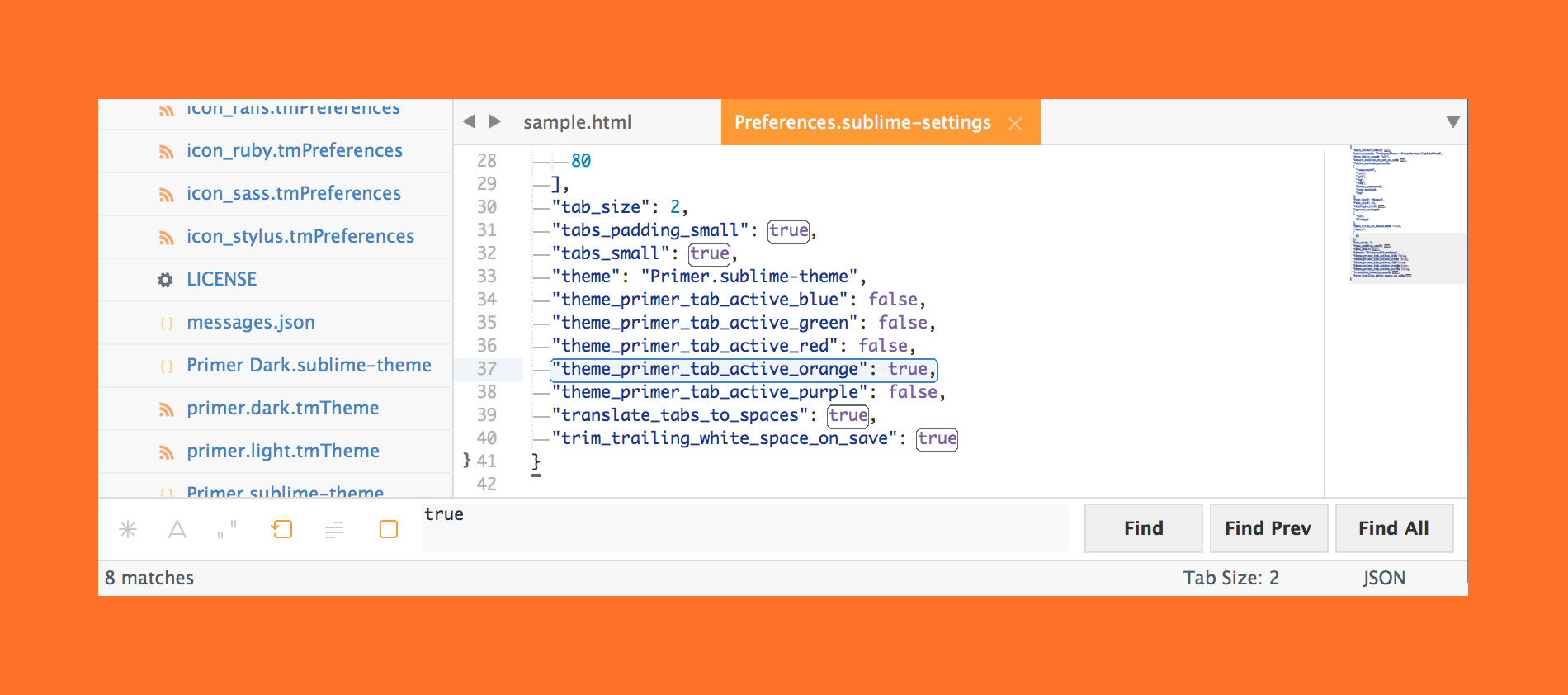
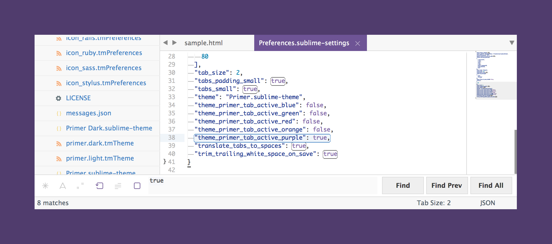
Accent Colors
Accent colors are used in a number of different places ranging from the active tab, matched text color in the quick panel, and others.
{
  "theme_primer_tab_active_blue": true,

  "theme_primer_tab_active_green": true,
  "theme_primer_tab_active_red": true,
  "theme_primer_tab_active_orange": true,
  "theme_primer_tab_active_purple": true
}
Tab Height
{
  "theme_primer_tabs_normal": true,

  "theme_primer_tabs_small": true,
  "theme_primer_tabs_large": true,
  "theme_primer_tabs_xlarge": true
}
Tab Font Size
{
  "theme_primer_tabs_font_normal": true,

  "theme_primer_tabs_font_small": true,
  "theme_primer_tabs_font_large": true,
  "theme_primer_tabs_font_xlarge": true
}
Sidebar Row Padding
{
  "theme_primer_sidebar_tree_normal": true,

  "theme_primer_sidebar_tree_xsmall": true,
  "theme_primer_sidebar_tree_small": true,
  "theme_primer_sidebar_tree_large": true,
  "theme_primer_sidebar_tree_xlarge": true
}
Sidebar Font Size
{
  "theme_primer_sidebar_font_normal": true,

  "theme_primer_sidebar_font_small": true,
  "theme_primer_sidebar_font_large": true,
  "theme_primer_sidebar_font_xlarge": true
}